
Share this:

Seeing beyond test scores by visualizing the shifting landscape of education access

By: Megan Danielson
The Educational Opportunity Project (EOP), a research initiative at Stanford University, recently published an interactive visualization of the Stanford Education Data Archive (SEDA): a comprehensive, national database of academic performance. The database houses over 8 years of data, covering 350 million standardized test scores from 50 million students from over 13,000 school districts and 70,000+ elementary and middle schools. Researchers from the EOP teamed up with Hyperobjekt, a web design and data visualization company, to transform this database into an interactive tool for policymakers, educators, journalists, and researchers.
I sat down with James Minton, the creative director of Hyperobjekt, to discuss how his team approached building the interactions and visualizations for such a large and nuanced dataset.
Why were you interested in working with the data from the SEDA project?
The SEDA database is a unique tool for tackling complex questions about access to education. It’s the first national database that measures education opportunities as well as academic performance. The database includes over 350 million standardized test scores taken by 50 million students from 2008–2009 to 2015–2016, as well as socio-economic data gathered from the American Community Survey (ACS). The project brings together enough information to thoroughly explore how access to educational opportunities varies from place to place, and consider factors such as race, gender, and socio-economic status. Because the data span over 8 years, you can also see how these opportunities either improve or degrade over time in schools and communities across the country.

We were attracted to the research team’s mission to build a more diverse understanding of ‘education.’ The database unlocks so many fascinating data visualization angles: How does access to educational opportunities vary from place to place? How do factors such as race, gender, and socio-economic status impact opportunities? How do opportunities change over a time span of 8 years? Unlocking the insights in these data can help policymakers and educators make better investments to improve educational achievements.
What are some of the main insights of this project?
There are many takeaways from this research — and analysis is ongoing — but one of the latest findings is about racial segregation and its impact on educational achievements. Researchers used the SEDA database to examine levels of racial segregation at every school district across the country, as well as the size of the achievement gap between white and black students in each of those districts. The researchers observed that racial segregation damages educational achievement because of how it also acts as economic segregation by concentrating minority students in high-poverty schools, which are, on average, less effective than lower-poverty schools.


What were your team’s biggest design challenges?
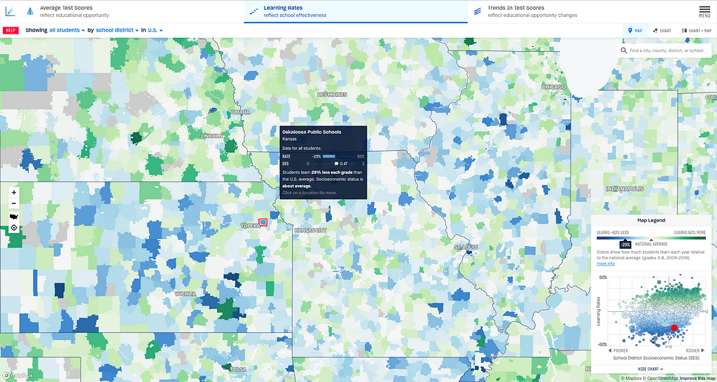
Usually, when people are presented with education data, they automatically start comparing ‘good schools’ and ‘bad schools.’ We wanted to shift this narrative and tell more of a relational story that offers insights into what influences educational opportunities in a region. First and foremost, that meant always including socioeconomic (SES) data about every place alongside the test score data; we had to work through how to display that data in various elements (like tooltips), as well as how to include a scatterplot chart alongside the map, so the relationship between poverty and test scores is always in the foreground.
The student achievement data (average test scores, learning rates, and trends in test scores) is scaled by grade levels above and below the national average; to depict that, we used a diverging color scheme, with dark green representing above average, dark blue representing below average, and grey representing average. Arriving at those colors took some time; we were careful to avoid colors in that scale (such as red) we felt might evoke more negative associations.

What is something that this map does differently with education data?
Maps are a natural way to make data relatable, because people can see ‘their’ places — most users first zoom into their hometown or school district. However, part of what we wanted to do with this project was to draw people into thinking beyond their local context. If you only look at districts that neighbor each other, you might be missing important insights about what affects educational outcomes. You can end up just reinforcing stereotypes or over-simplified explanations. To combat this, we built a way to easily look up other school districts that are of a similar size, socio-economic status, or demographic composition. This makes it easier for superintendents, policymakers, journalists, educators, and community activists to compare apples to apples. It also helps users ask more nuanced questions of the database, such as: “Where are test scores improving over time in one place relative to another place?”, “Where are schools being more or less successful and where aren’t they?”, or “Where are educational achievements improving?”.
What’s next for the project?
We are working on making updates to the website that will pack in many new features including states as geographic units of analysis, filtering by size and school type (e.g. traditional public vs charter), margin of error as part of the data reporting, and a major overall revision to the user interface and its controls.
The Mapbox Community Team provides tools and resources to individuals and organizations using maps for positive impact. Learn more about Mapbox Community and get in touch with our team.
Megan Danielson – Community Program Manager – Mapbox | LinkedIn
Stanford Education Opportunity map was originally published in Points of interest on Medium, where people are continuing the conversation by highlighting and responding to this story.


More Stories
Will County, Illinois 1864 Map – May 20, 2023 at 04:14AM
This kid on Google Map trying to get by – April 27, 2023 at 05:05PM
World of Hyatt: Complete list of all-inclusive properties in Europe (with map) – April 27, 2023 at 04:57PM