
Share this:

Following on the initial post, this is a presentation live-streamed on YouTube: thanks Daniel P. Hoffman for organising How to do Map Stuff today! The full notes are on Slideshare, 10 slides intro and step-by-step after that. Note that while data are open and the process can be done on any platform, the coxcomb symbology (slide 21) is in ArcGIS Pro, tho someone may redo it elsewhere, stay tuned.
Although I seem to live on Zoom thru the pandemic lockdown, this was my first live-stream and Daniel gave an excellent how-to should you have a yen for it. While I managed to switch between maps, browser and spreadsheet, I kept it KISS sans video showing me etc., next time…
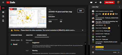
Here is what it look like during and after, respectively, thanks everyone for attending!
 |
| click to enlarge |
 |
| click to enlarge |
The best part, however, were the comments and interactions during live chat… and the enthusiasm in the GI community is palpable! And that’s not to mention twitter.com comments, follow the hashtags #mapstuff or #HtdMS. This was my favorite:
Perhaps the most immediately relevant presentation is up first! @azolnai works the 250-odd (and growing) viewers through compiling @healthmap data to visualize #COVID19 infectious arrivals in the UK on @ArcGISPro
.
.#HtdMS #GIS #mapping #cartography pic.twitter.com/Dpta5COzVQ— Evan Levine (@LevineRx) April 29, 2020
 This information was first published on http://blog.zolnai.ca/2020/04/coronavirus-time-enabled-maps-part-ii.html


More Stories
Facebook Fact-Checker CENSORS Heritage Video Quoting Biden’s Own Words on Gas Policy – March 19, 2022 at 06:49PM
General Mills (GIS) Gains But Lags Market: What You Should Know
CAD Designer